Maxine Wylde’s Expert Guide To Colourful Interiors
Fashionably furnished
By Teagan Witherow | 30th July 2024Maxine Wylde, the esteemed fashion authority and social media personality, has recently redirected her fashion eye towards the realm of interior design and it’s the ultimate fashion-centric approach to refreshing space. The key? Colour, of course. More specially the Solstice palette from the 2024 Dulux Colour Forecast. We sat down with Maxine to chat more about her space transformation.
Hi Maxine! We’re so excited to have you join us. With a huge following and a reputation for creating colour theory styling content, we’re curious to know: what sparked your passion for colour styling? Honestly, the path that led me to loving and experimenting with colour was so organic, I was playing around in a clothing store on a trip I took to New York with my now fiancé, Phill, quite a few years back, and I tried on a green jacket with a purple turtleneck and it was as if something just clicked inside my brain! I have always loved colour, so I found it so fun to apply it and experiment with it through my outfits!
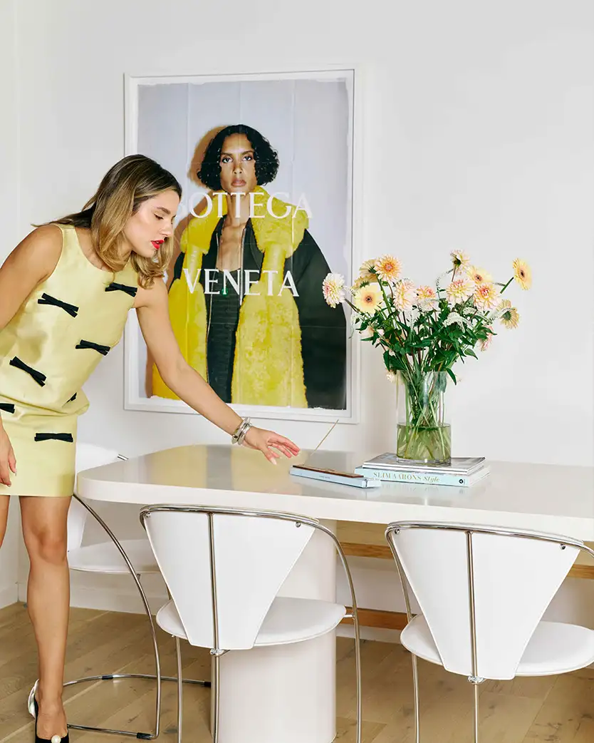
You recently took on a different type of design challenge outside of fashion, restyling your living room and hallway. Tell us, how do you see your home as an extension of your personal style, and what inspired you to merge your fashion style with your interior design approach?
I studied interior design, so this little challenge was so so fun! I loved getting back to my passion and love for interiors and applying the colour theory that I use to get dressed in the space I live in! It is definitely an extension of my personal style, so I wanted it to really emulate the tones and vibe of my current wardrobe – which is all about creating bold and trendy outfits by combining an eclectic mix of patterns, textures, and shades.
What’s your formula for combining organic neutrals with statement colours, and how do you know when to hold back or go all out? If there’s one thing that I’ve learnt over the last few years being a maximalist girly is that sometimes neutrals are needed! This is something I’ve been playing with a lot recently in both my fashion and interior, a neutral can be vital to really round out the colour palette and bring everything together! I think I was a bit scared to wear and use neutrals in the past as I’m such a colour girl, but it has been so refreshing! If you are going for a neutral to pair with your colour, all I will say is that you need to make sure you get the temperature right. Pair cool colours with cool-toned neutrals and warm colours with warm-toned neutrals!
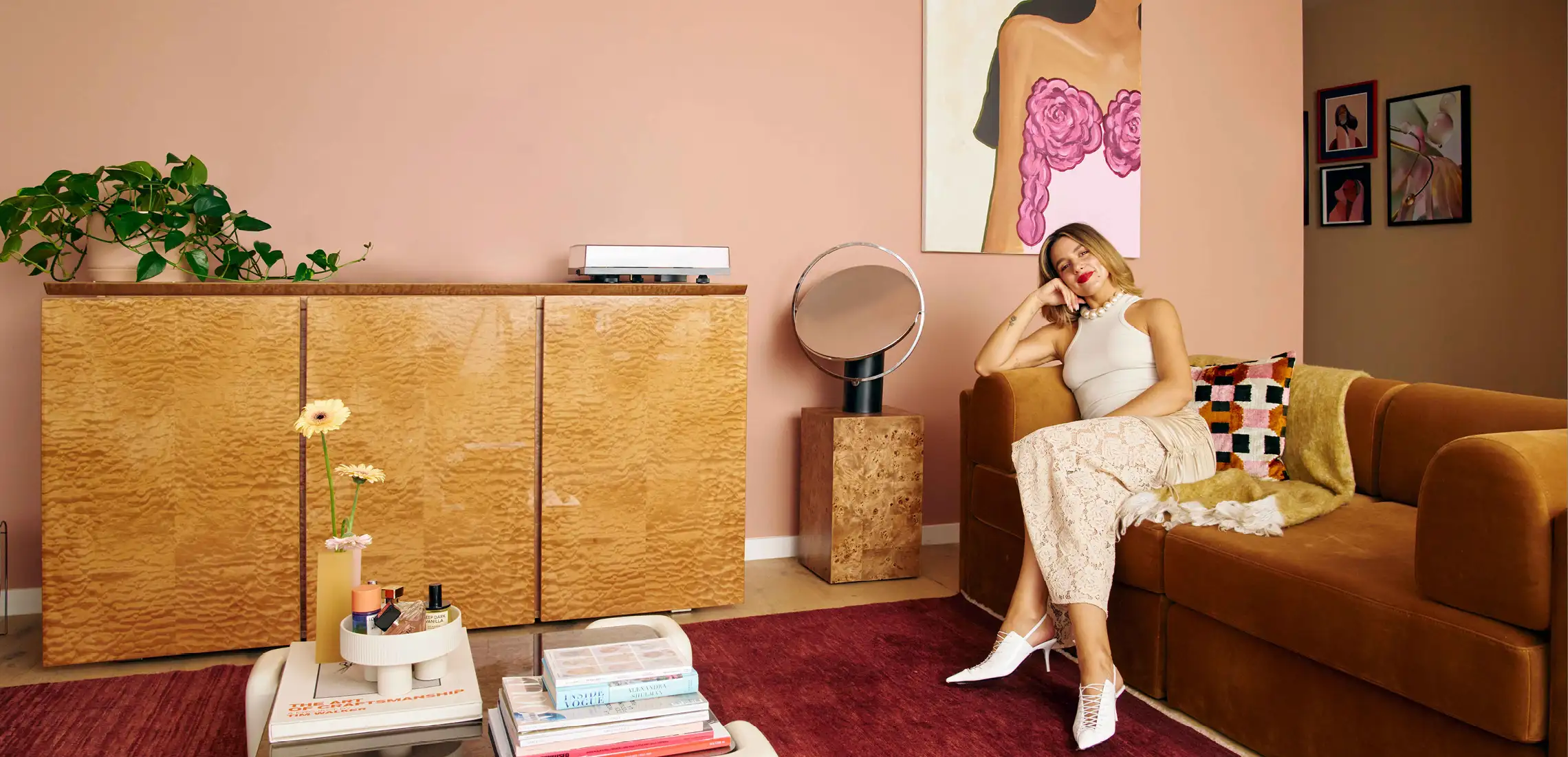
You used the Solstice colour palette as guidance in your recent revamp – describe in your own words the colour palette, and what made you go with this direction? It’s incredibly warm and retro. My interior style is a mix of vintage 70s vibes with modern touches, so I wanted to reflect that with my new colour scheme to help tie in all of the special furniture pieces I had collected. I was drawn to Dulux Potter’s Pink and Dulux Lama for my living room and hallway feature walls, for their warmth and nod to colour palettes seen so frequently in 70s interiors and style. I love the depth of the overall palette, with the deep red browns concentrated against the pale peach and light blues – there are so many combinations to play with to evoke a familiar and inviting atmosphere.
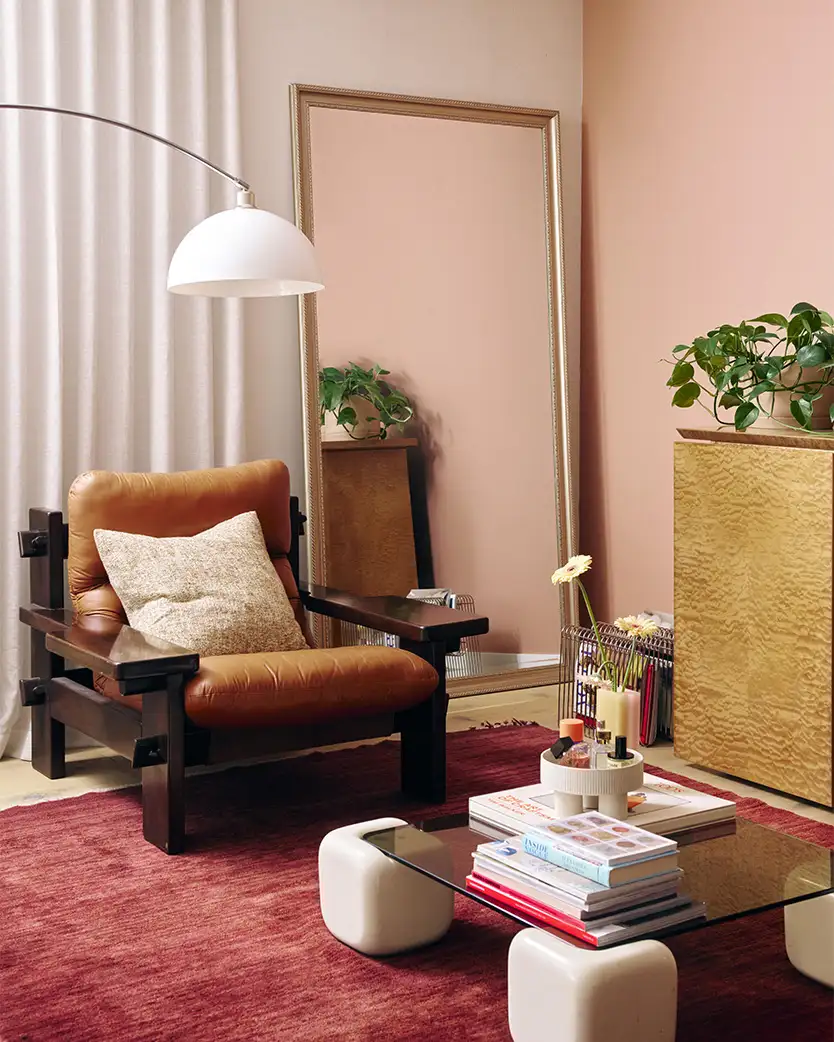
How do you strategically use a feature colour to create a cohesive look that goes beyond just one statement wall, and what are some tips for incorporating it into furniture, décor, and accessories? It can be helpful to choose three or four colours from a colour palette you love and play around with the quantities until you get the balance just right. You can reference feature wall colours within other decorative objects and furniture pieces, but sometimes less is more – don’t incorporate this colour into every item in your space. And sometimes, introducing a contrasting colour can help make a space feel more cohesive, add a level of interest, and ground a space.
What advice would you give to our readers who want to recreate the Solstice palette in their own space? Start with the colours you love from the palette that evoke positive emotions when you are surrounded by them. Look at what colours from the palette may already exist in your space and play around with a mood board to see how the colours and textures might work together before you make an impulse decision to paint one weekend. If you’re hesitant to add paint immediately, ease into this colour palette by introducing little splashes of colour at a time through decorative objects, such as throws and cushions. This is a helpful way to get a feel for living with the colours you love. By working within the confines of this palette you can create so many colour schemes that you know will work together, whether that’s a more tonal look that features warm whites and neutral shades or a style that incorporates more contrast with varying pops of colour.


