SABO Has Opened The Doors To It’s New HQ And It’s A Design Marvel
Fashion meets interior design
By Bianca Licina | 2nd April 2024Let us introduce you to SABO HQ.
There’s no doubt you’ve heard of the Brisbane-born fashion empire, SABO. Founded in 2011 by sisters-in-law and best friends, Thessy and @Yiota, SABO evolved from a humble fashion blog turned online store into a globally recognised label.
Known for its Mediterranean-inspired prints and feminine styles, it’s not hard to spot a SABO piece in the wild, flaunting unique and highly sought-after designs.
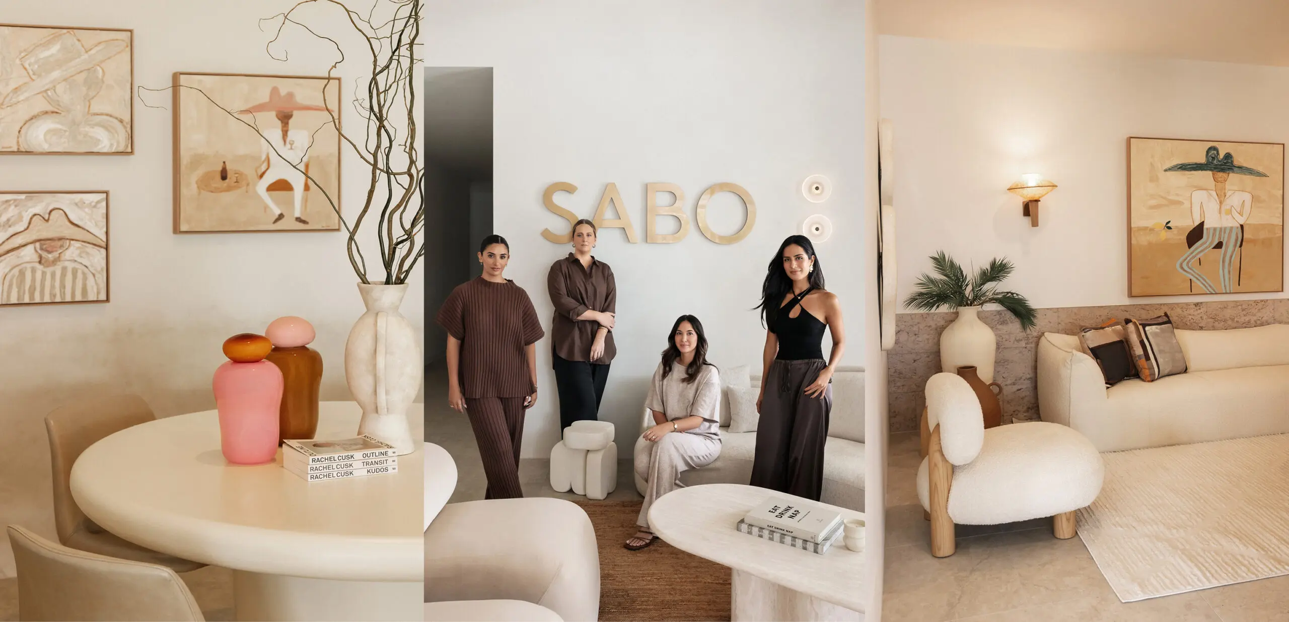
With a growing fan base and increasing acclaim, it’s only fitting that a global brand has a world-class office. For Thessy and Yiota, an office space isn’t *just* an office space. Their office is a reflection of the brand itself and its vision for the future. After all, it’s where all the magic happens! This meant that when it came to designing their dream space, it was a job fit for only the best in the biz. That’s where the Residence Studio’s Laure and Tara came in, Brisbane’s premier interior design group whose ethos of ‘reimagining luxury’ brought the founders’ vision to life.
To get the inside scoop of the inspiration, process and design choices of this project, we sat down with the lovely ladies behind Residence Studio to gain exclusive insights into the making of SABO HQ.
What inspired the design for SABO HQ in Brisbane and how did you reflect Thessy and Yiota’s brand?
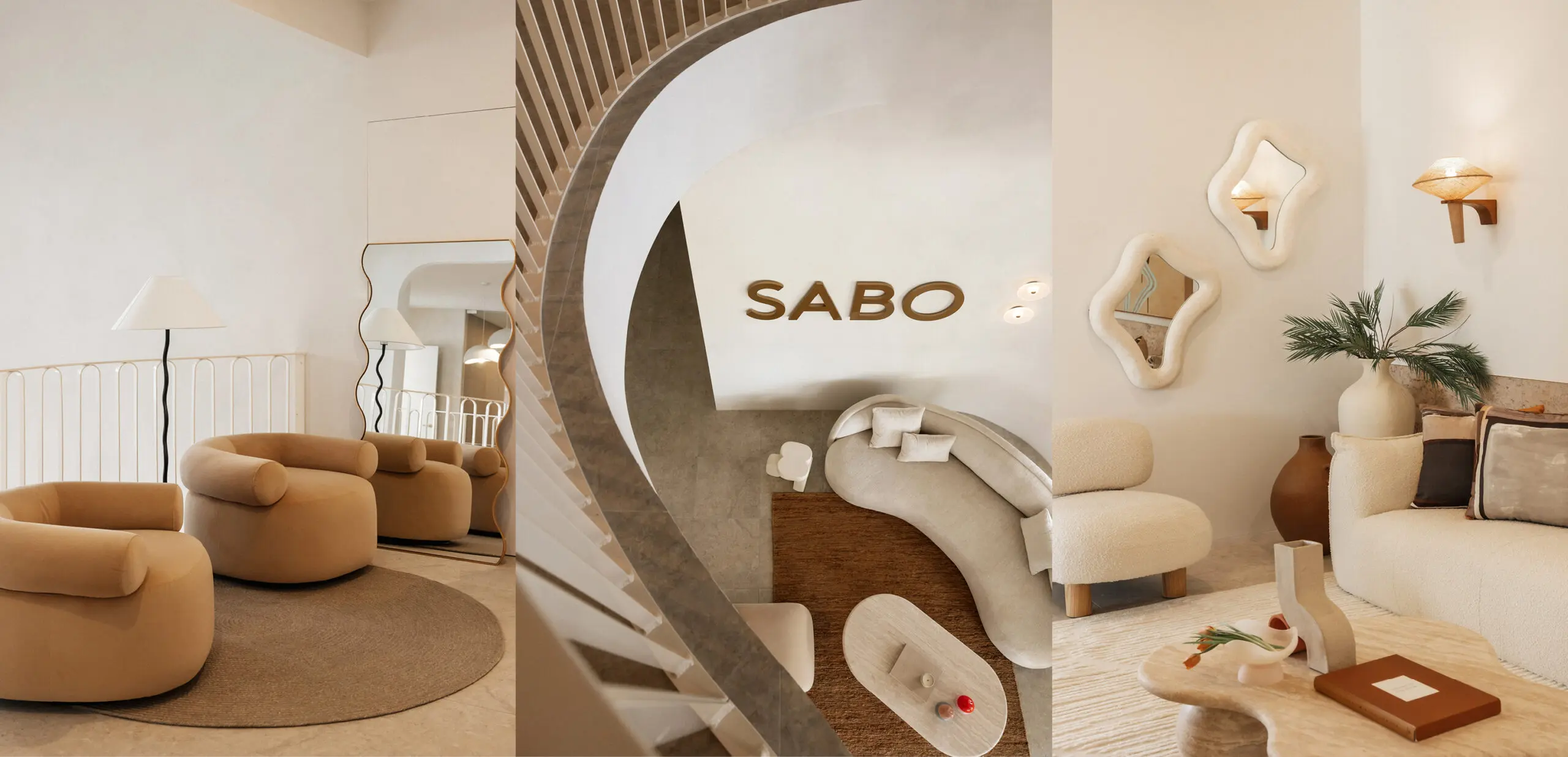
When we met to discuss the initial look and feel of the HQ, we focused on a Mediterranean-style design that had organic and textural elements whilst still being contemporary and luxe. The SABO HQ design concept needed to be refined and timeless but reflect the aesthetic of the brand, be forward-thinking and trend-setting.
How closely did you work with Thessy and Yiota to bring their vision to life?
Designing SABO HQ was an extremely collaborative process with everyone being very focused on the same end goal.
We met with Thessy and Yiota in 2022 to understand what they wanted from their HQ space and came back with a design concept that tied together their feedback and the overall look and feel of the HQ. From the beginning, we all loved the look of the concept and it evolved during the construction process – we couldn’t be more happy with the outcome.
What were the fun challenges in designing for SABO? How did you get creative with them?
One of the main design visions of the SABO HQ was to design areas that could be used as backdrops for photos of their clothing. This meant that every part of the space needed to be visually beautiful and align with their aesthetic. This allowed us to inject different personalities in each area through the use of finishes or furniture. As the project was more on the minimal side, we really had to select finishes that would speak volumes and create the most impact both in person and through a camera lens.
How does the office layout promote teamwork and productivity?
The SABO team work closely together and therefore it was important to Thessy and Yiota to have an open office floor plan with no hierarchy to promote plenty of collaboration and teamwork. We did this by creating an executive desk area to one side where they can still have privacy and be included with their team, but also private offices and meeting areas that everyone can use.
During the design process, we were conscious to create different areas that the SABO team could meet, both informal and formal, this also allowed for different ‘themes’ that could be used in photoshoots for the brand as well.
What comfort features did you include for Team SABO?
We had several lounge seating options for the team to ensure they had various areas and settings to break out into. Sometimes, working in the same room with the same setting can become tedious which is why we made sure the meeting room, boardroom, staff lounge and other areas were all different whilst still working back with each other.
There is also plenty of natural light in the space which we complemented with light-toned finishes. This presence of light psychologically boosts the production of serotonin, making it a comfortable workplace for the team.
Are there any eco-friendly or sustainable touches in SABO HQ? How do they add to the vibe?
“The main office area is such a large, open area and we knew we wanted to select something that was renewable, biodegradable and had acoustic insulation properties. We went with The Flooring Co cork flooring because it had all of these properties, plus, the neutral colour-way worked perfectly with the rest of the scheme. We have seen a rise in cork flooring in recent years and it just made sense to select this finish for the main office.
During our design process for our projects, we are always conscious to support local Australian-made suppliers and manufacturers. We did this by choosing hard-wearing, locally made designer pieces that would fit SABO’s aesthetic, as well as provide a point of difference from other office interiors.
We were also conscious of selecting specialty wall paint finishes with a low VOC (Volatile Organic Compounds) to minimise atmospheric pollution. Porter’s Paints uses premium raw materials in their paints and supports Australian suppliers. Their lime wash finish was the perfect addition to the feature walls in the SABO HQ, creating the perfect amount of texture without taking over the other elements and also really fits the organic Mediterranean look and feel.”
What makes SABO HQ unique among other offices in Brisbane?
“The way we’ve designed SABO HQ is to make it feel like a home, not just a typical office. SABO creates timeless pieces of clothing whilst also staying on top of trends so we wanted to reflect this in the interiors. The way the fashion translates into the interior is what makes this workspace unique.”
How did you collaborate with architects, engineers and others to make the Sabo HQ design a reality?
“We worked very closely with their Architect, Esat Design and Builders, Batspac to make sure that Thessy and Yiota’s vision as well as Residence Studio’s vision for the space came to fruition. The architect created an amazing base for us to work with and it really informed our design decisions in regards to finishes, fixtures, fittings and furnishings. Zaheer from Esat was really easy to work with and always very open to collaborating, as were Batspac. If there was something we had specified that couldn’t be done for whatever reason, they came to us with different options that were in keeping with what we had originally chosen and from there we were then able to come up with a solution. Overall, it was a very collaborative process with the whole team and everyone was very open to working together.”
How did you ensure the design stays relevant as SABO evolves?
“We made sure the interiors were timeless with a neutral palette and tried to steer clear of trending interior design elements that could date quickly. By having a neutral palette, it means that as Sabo evolves and if their branding ever changes, it would be just a matter of adding a few different cushions and changing the decor to create a whole different feel in the space.”
Photography by @CorrinaLouisePhoto


